Maps

The world map is a lie.
Well, sort of. If you think of a 2D, rectangular world map, the image that comes to mind is what's called a Mercator projection:
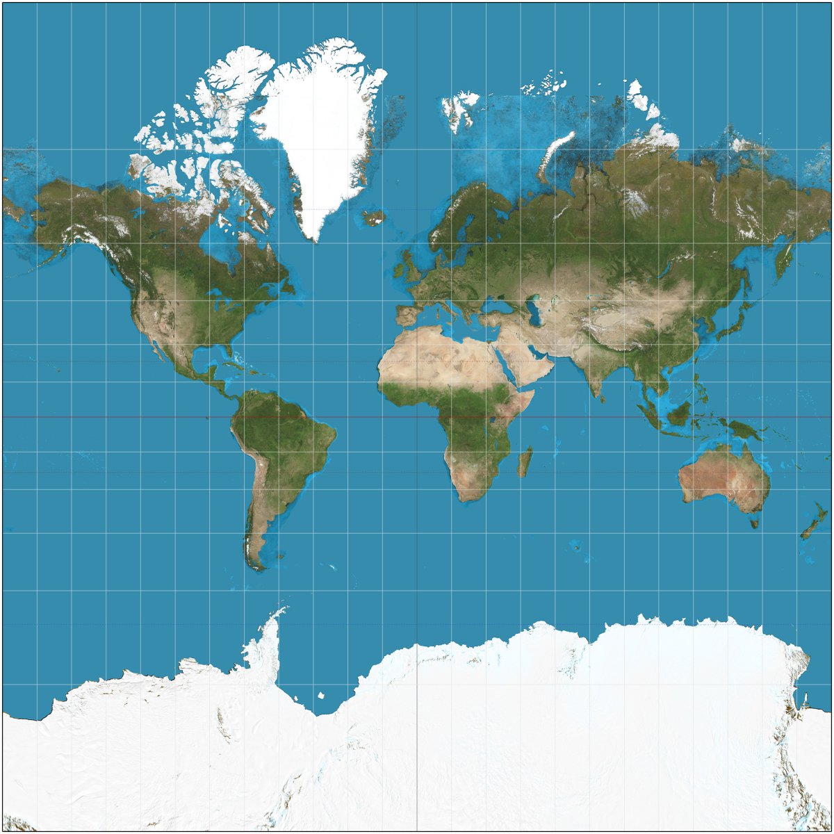
It's... a map, no doubt, but with some very obvious distortions. The most obvious one being Antarctica, which seems like almost another planet, as well as Greenland being absolutely massive and seemingly the same size as Africa, when it is in fact 1/14 the size.
Representing a 3D sphere (Earth) on a 2D surface is fundamentally impossible, because distortions will always exist. The reason why the Mercator map more or less became the widely accepted 'standard' is because it preserved directionality and the shape of countries, which is very important for sailors when navigating. This was the 1500s, after all.
There's plenty of discourse on the 'whys' of it all, ranging from simple mathematical challenges to more complex arguments about perpetuating Western/European superiority. That's an academic discussion well beyond me.
However, it's worth us quickly just considering how our literal world view can be generically shaped if we don't take some time to analyse and evaluate. As we're now firmly into a globalised era and sometimes jet-setting our way across the world, that can offer an interesting means into rethinking our perception of the world map. For example, Australia is actually huge. While it may not look it on a 'traditional' world map, the flight time from Perth to Sydney is more or less the same as that from London to Moscow.
https://www.thetruesize.com/ is an interesting tool that let's you overlay countries atop other regions to get a realistic sense of size and scale. Using it, you can see that you could fit most of the European landmasses within Australia:

Brazil - Absolutely massive. Alaska - actually not that big at all.
So, is there actually an accurate way to represent Earth on a map? Interestingly, one Japanese designer seems to have it (almost) figured out. Hajime Narukawa created something called the AuthaGraph World Map, and actually won the grand prize in Japan's biggest design competition. It's not perfect, but it's close. It also offers an interesting and different perspective of the map of the world.
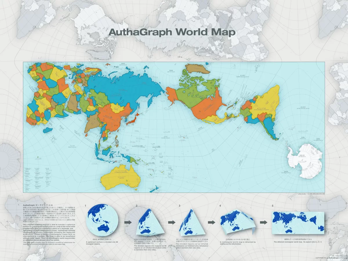
Maps. Makes you think.
~ Desmond
0 Comments
Recommended Comments
There are no comments to display.
Create an account or sign in to comment
You need to be a member in order to leave a comment
Create an account
Sign up for a new account in our community. It's easy!
Register a new accountSign in
Already have an account? Sign in here.
Sign In Now